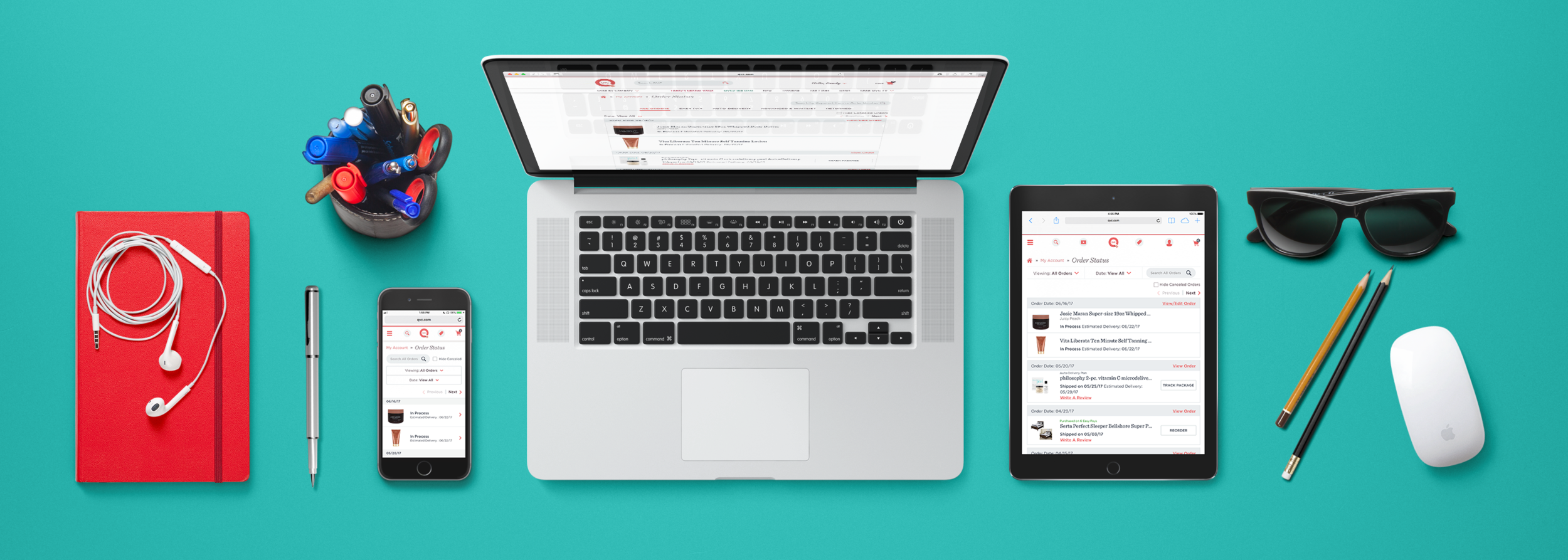
QVC My Account
Overview
QVC (Qurate Retail Group) is a global cable network and retailer, broadcasting to more than 350 million households in seven countries as QVC US, QVC UK, QVC France, QVC Germany, QVC Italy, QVC Japan and QVC/CNR (China). As QVC continues to grow, online, on-air and through mobile, the account pages are a critical component to success and re-platforming QVC.com was the perfect opportunity to re-imagine My Account.
Define
Hypothesis: Re-imagining and re-designing the My Account section of the QVC website will increase buying sessions post-purchase and reduce customer frustration (measurable through VOC).
Markets: US, UK, DE
Platforms: Web only (web-views in apps)
Key Results: Reduce departure, Convert into buying sessions, Improve the delivery experience
Team: UX Designer (me), UX Researcher, Product Manager, Product Owner, Scrum Master, Back-End Developers, Front-End Developers
Discovery
Before we could dig in, we recognized that one of our first and most important challenges would be to streamline the user flow. Currently customers have identified pain points when managing their Easy Pay and Auto-Delivery, viewing Order Status, and tracking an item. First order of business? Gather customer feedback leveraging our touchpoints to capture VOC (voice of customer).
Our discovery research consisted of Opinion Lab submissions, customer surveys, Customer Service calls, and a competitive reviews. I worked with an Information Architect in order to help summarize and communicate our research insights. Some key opportunities we identified included: consolidating the account information pages (7 pages) into one Account Settings page, creating true filters for Easy Pay and Auto-Delivery, and surfacing tracking information on Order Status.
Entering the design phase, our small UX team was equipped with a focused, unified vision for the reimagined My Account experience. We created user flows and wireframes, and communicated updates to the My Account Journey Team.
Develop
As the UX lead on our team, I translated our wireframes and sketches into high fidelity designs for different target devices. I created consistent responsive-friendly design patterns, and as a team we planned to refine and resolve responsive behaviors in browser. From a design perspective, my goal was to establish a clean design through the use of generous white space and large, touch friendly UI controls consistent with the QVC Checkout experience.
Key Features:
Mobile-First Design: Introduce mobile breadcrumbs for additional navigation
Relevant information based on device: we removed the product description on Order Status and validated with usability testing
Reduce Friction: Remove complexities and steps required to manage Easy Pay and Auto Delivery plans
Order Transparency: Provide a simplified view of Order Status and Package Tracking
Shared Component Library: Consistent forms, confirmations, formatting of payment method and addresses
Real-time Form Validation: user is provided real time confirmation or error on input
To validate the updated designs, we utilized the Customer Behavior team to conduct usability tests. This research helped us identify additional opportunities, iterate on designs, and validate updates through another round of user testing.
Deliver
The MVP launced in October 2019.
Preview the Prototypes:
US Mobile Prototype
US Desktop Prototype
UK Mobile Prototype
UK Desktop Prototype
Germany Mobile Prototype
Germany Desktop Prototype


